How to Use Interactive Demos for In-App Activation

Head of Growth & Product Marketing
Setting up integrations, configuring admin access, and general busyness are all major blockers to user activation.
So how can you motivate people to cross the finish line?
Interactive product demos can improve free trial activation by getting users excited about the value of your product and encouraging them to jump into the tool and reach the aha moments they need to convert.
Below, we’ll share how to incorporate interactive demos into your onboarding process, along with examples from three of our customers.
In-app interactive demo benchmarks
According to our State of the Interactive Product Demo Report, roughly 10% of top-performing Navattic customers use interactive demos in their products for onboarding and activation.
For in-product activation demos, our top customers saw a 66% engagement rate — nearly 10% higher engagement than a marketing website demo.

Even more impressive, these demos convert 47% of the time.
And it makes sense. You have a highly engaged audience already using your product.
How interactive demos can improve activation rates
Interactive demos boost activation rates in three main ways: getting users over the sign-up hump, demonstrating value quickly, and enabling fast iteration.
1. Unblock users from the fear of signing up
Even if you have a free or freemium product, users may still be worried about the effort required to set everything up.
And if there’s a credit card gate, they’ll really want to make sure your product is legit.
Our customer, Chainstack, overcame these objections by adding an interactive demo before the sign-up experience.
First, their team analyzed their funnel metrics, starting with how many monthly website visitors they got, how of those many clicked on a ‘Start for free’ CTA, and how many never completed the signup process.
Then, Pulkit Sachdeva at Chainstack explains, “We did some more back-of-the-napkin math in Excel to calculate the potential dollar value return for every 1% of people we could re-engage through an interactive demo.”
The value, turns out, was comparable to or slightly more than the subscription cost of Navattic.
2. Get users to aha moments faster
An aha moment is a point at which most users grasp your product’s value. Ideally, your free trial or freemium plan gives users multiple aha moments, highlighting the many ways they can use your product and the ROI they can expect from it.
One of our customers, Trainual, used Navattic to showcase a curated and interactive version of what it felt like to use their product.
Their goals were two-fold:
- Getting users to lightbulb aha moments before even starting a trial
- To communicate Trainual’s value early in the evaluation process
By adding an interactive demo to their website, Trainual saw a +100% lift in users reaching activated trial status seven days post-signup.
3. Faster time to deploy experiments
Since interactive demos are no-code, you don’t have to wait weeks or months to try activating users in new ways. You have total control over the demo experience.
Another of our customers, Phrase, has capitalized on fast experimentation without having to engage engineers or IT:
“From start to finish, our team was able to build and launch the demo without ever needing to engage engineering resources.
We were able to build out our first end-to-end demo experience in a matter of days, a project that could have taken weeks if we needed to engage other teams.”
How to add demos to product onboarding
Adding demos to your free trial and freemium workflows is relatively easy. Here are three ways you can get started:
Option #1 (easy): Add product tours to email onboarding sequences
Chances are, you have an onboarding email sequence to remind users that the free trial exists and describe the features they can explore.
So, why not add an interactive demo to your flow?
Navattic customer, MonitorQA, decided to include interactive demos in their onboarding email series to expose users to more of the product’s high-value features and get them to re-engage with the free trial.
“We have seen an increase in people ultimately setting up their free trials than we did before. This has caused the number of abandoned trial accounts to dramatically decrease so much to the point it’s no longer a pain point on our radar.”
You could even consider making multiple demos — one for each important feature — and adding those to corresponding onboarding emails to increase the likelihood of activation.
Option #2 (medium): Add an interactive demo as an exit intent pop up
It’s easy for users to get distracted and bounce from a free trial. Exit pop ups can prevent that from happening by prompting users to keep going.
Using interactive demos as exit pop ups can offer additional setup help and underscore the value of your product in general. Free trailers may not know how to set up the product or what the product’s value prop is.
Set an exit intent pop up to appear after a certain amount of inactivity so that you don’t lose disengaged free trialers forever.
Option #3 (advanced): Include demos in your product onboarding experience
The last thing you want to do is leave your new customers hanging. Instead, add them directly to your new user onboarding experience.
Most Navattic customers use interactive demos to ease users into the flow, educating them on the features they can use without having to set anything up.
Others take their interactive demo strategy to the next level. Julia Schlocker at neuroflash, for example, identifies the features that help most with retention and puts those interactive demos front and center.
“We determined what features help us in retention and make sure that users (free users especially) convert. We build one flow for each of those features, and then we get the users in our app to click on it inside what we call a “learning center.”
Four top customer in-app examples
Let’s take a look at how three B2B SaaS companies have added interactive demos to their onboarding experience.
1. Apollo
The Apollo GTM team recently joined us in a “Not All Demo Automation Products Are the Same” chat with Testbox.
In our conversation, Apollo revealed why and how they use interactive demos to activate early users in their free trial onboarding experience.
Their team shared:
“Interactive demos require users to click through and learn by doing vs something like a video. It delivers the value upfront and is a much more dynamic experience to showcase an interactive demo.”
Their in-app sequences tour, for example, takes users through each step of sending an email to Tim, Apollo's CEO, from creating a new sequence to adding dynamic variables to adding contacts.

Guiding users through the process while they’re starting with Apollo makes using it far more approachable. Plus, it helps users see the value they’ll get out of it.
The team notes, “When creating these in-app tours we made sure it wasn’t just about giving people a step-by-step walkthrough of the product but also highlighting the platform’s value.”
Within Apollo, users can access interactive demos at any time in the Help sidebar, giving them immediate assistance whenever they get stuck.
The best part about in-app interactive demos? They’re easy for the Apollo admins to update.
“Creating this onboarding material on Navattic is much faster than our traditional videos.”
2. MonitorQA
Mobile inspection software, MonitorQA, has a complex backend that’s tough for free trailers to navigate.
To avoid dropoff, the MonitorQA team triggers an exit intent pop up when a free trailer is inactive for a certain period of time.
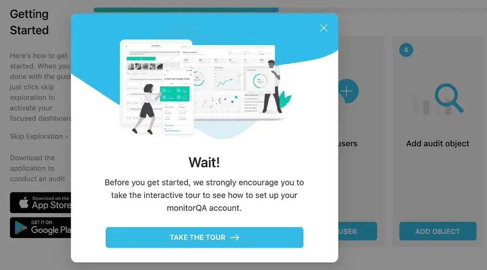
By suggesting they go through a tour, MonitorQA ensures that users complete the setup process, see the most notable features, and hit critical aha moments.
3. Matillion
Like MonitorQA, Matillion has a somewhat complicated product, meaning some users need extra guidance to figure out how data transformation works.
To make sure they’re meeting user needs, the marketing team presents free trailers with a choice — go through a product tour or dive straight into the tool:
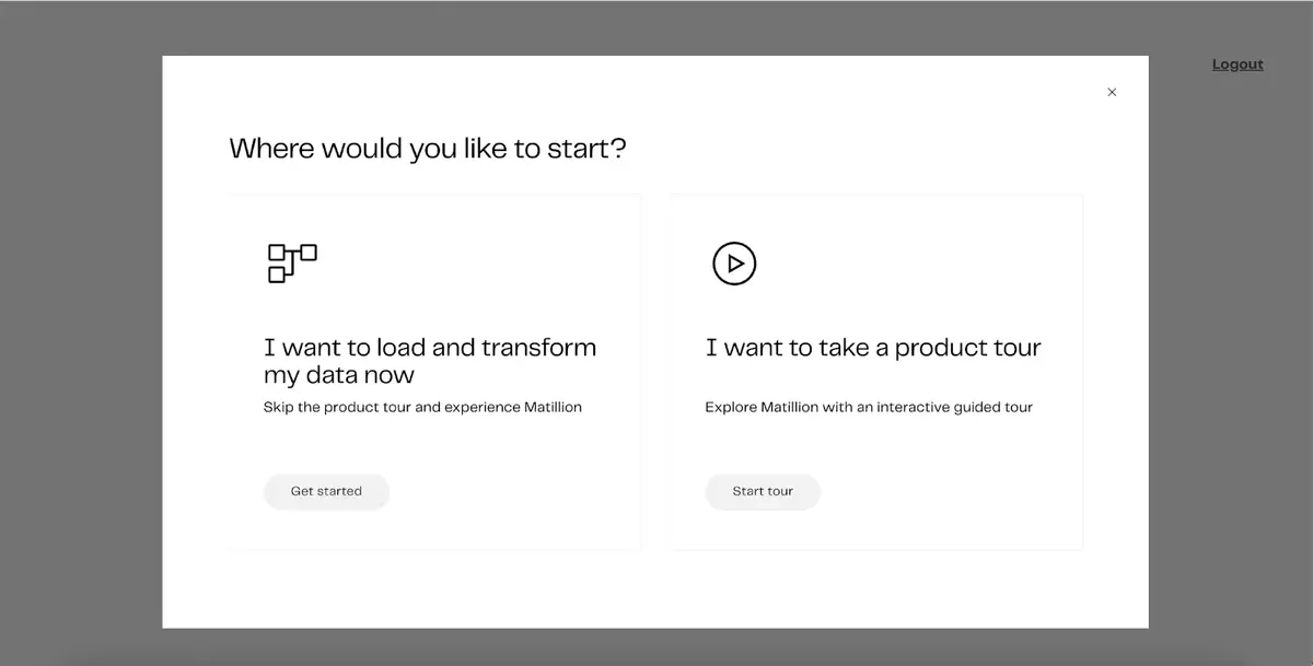
Within the tour, users are presented with even more options. They can start from the beginning, transforming or cleansing their data. Or, they can view their credit consumption or explore other Matillion functionality.
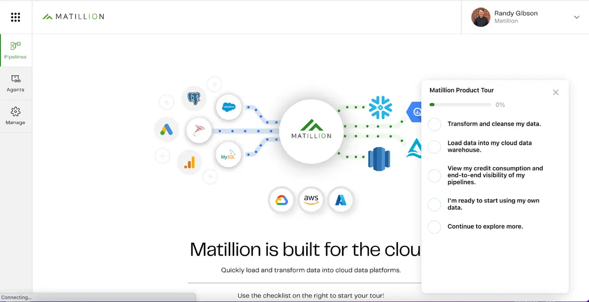
Giving users a choice of how and what they learn increases the chances they’ll stick around and helps them appreciate the product’s overall value.
4. Datadog
Datadog, a cloud monitoring service, uses interactive demos in their security management product free trial.
When users log in, they have multiple ways to get started — including immediate access to a guided tour. Clicking the “See a Guided Tour” button takes users to a full-screen tab with an interactive demo.
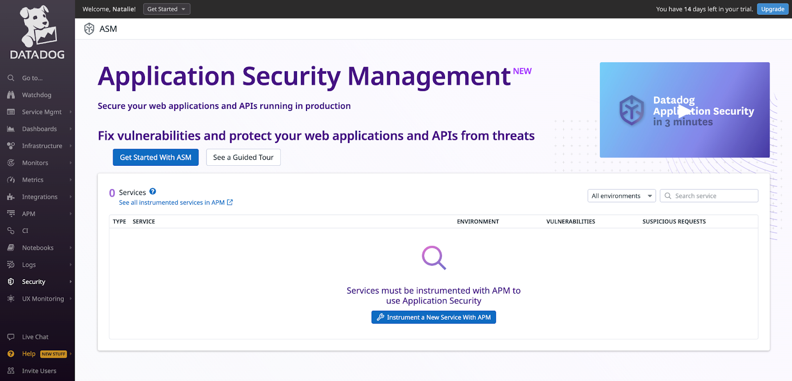
The interactive tour takes them through the complex product, highlighting Datadog’s reliability, performance, and vulnerability monitoring services in a seamless, intuitive way.
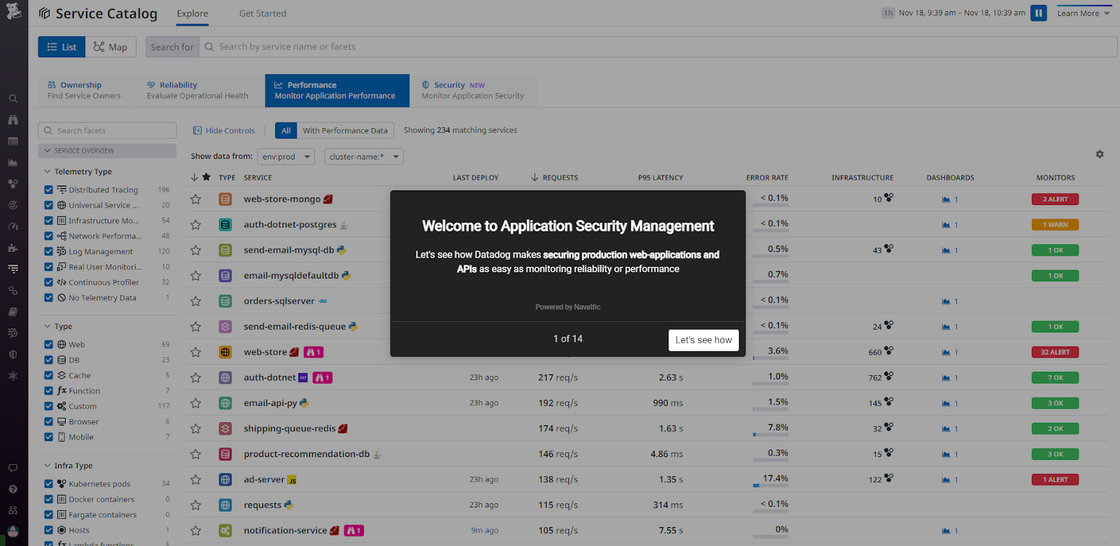
After the demo concludes, prospects have a better idea of what the security management module can do and how it works with other existing features, enabling them to use their free trial to the fullest.
Interactive demos can be instrumental in driving activation — but that’s not all they can do. Read our guides to learn more ways to maximize your interactive demo ROI: