Customer Show + Tell: In Product Activation with Julia Schlocker

Head of Growth & Product Marketing
About this series:
We spoke with the builders whose interactive demos were part of the top 1% of top-performing interactive demos from our State of the Interactive Product Demo 2024.
See how Julia Schlocker at neuroflash uses Navattic both on their website and in-product to activate more users.
How do you use interactive demos at neuroflash?
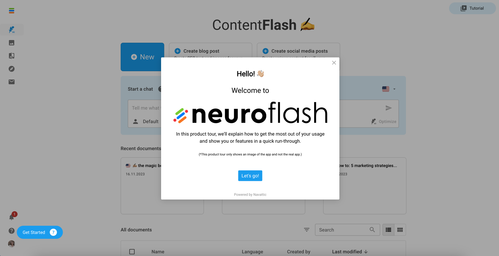
Neuroflash is a content creation software powered by AI for text and images. Our main goal with interactive demos is to educate our users on how to effectively use our software.
Most users felt very overwhelmed with our software. We have lots of different tools and users reported to us that our app feels complicated and just overall too much at one place
We aimed to reduce this confusion because understanding the app makes it easier for users to achieve better results, leading to happier, long-term customers.
Despite offering a freemium plan, we noticed users would try one feature and, if unsuccessful, not return. Our interactive demos aim to thoroughly educate users on our features, encouraging continuous use and learning.
Where do you use these interactive demos?
We've adopted a two-pronged approach for our product tours: one for our website and another for our app, catering to the different audiences each platform attracts.
Website visitors might be at the earlier stages of interest or just browsing, whereas app users are already signed up and show a genuine interest in neuroflash.
For website visitors, we designed a tour with various CTAs, aiming to convert them into registered users by demonstrating what our product offers. This strategy is based on the assumption that after engaging with the tour, these individuals might be more inclined to sign up and explore the functionalities they've just seen.
For the users in our app - we educate them on the features that we have with interactive product demos. We determined what features help us in retention and make sure that users (free users especially) convert.
We build one flow for each of those features and then we get the users in our app to click on it inside what we call a “learning center”.
Additionally, new users receive a prompt in the notification center inviting them to explore these features right after registration, ensuring they're immediately introduced to the value our product provides.
Have users who engage with the in-product interactive demos had higher activation rates?
The results have been quite revealing, especially when we look at the average time spent on these product tours. Starting with our website, visitors who aren't yet users of our product spend about 6 minutes on the tours, which is significant.
This duration indicates a strong interest, as it's crucial for reducing bounce rates and engaging potential customers.
For actual users of our app, the engagement is even more pronounced, with an average time of 16 minutes spent exploring the product tours.
We interpret this as a sign of thorough education about our product's benefits, suggesting that these users are more likely to convert to paid plans afterward.
What did the building process look like?
Initially, as a startup, our approach to implementing the product tour was somewhat experimental. We didn't have a detailed plan; we simply wanted to showcase our features and see how it would pan out.
The success of these tours led us to refine our process. We started from zero and engaged with our teams to pinpoint the features we aimed to highlight.
Incorporating a checklist into the process helped us a lot. This checklist grants users the freedom to navigate through the demos at their own pace.
They can explore as they wish, if they want to leave they can easily jump back in later with the checklist.
If you have a new team member who's just starting with Navattic, what tips would you give them?
Planning is crucial, a lesson we learned the hard way. While setting up another tour is straightforward—the challenge lies in defining the tour's content and objectives.
The basics might take only a few minutes, but as you delve deeper, you realize the possibilities, which can extend the development time significantly.
Consulting with team members, especially those in customer success who are aware of frequently asked questions, can streamline the process by addressing common queries right from the start.
However, there comes a point when you must decide to stop. Continuous development can go on indefinitely, but given our software's dynamic nature with frequent releases of new products and features, it's essential to draw a line and say, "This is good for now," with plans to optimize later.
This approach has been incredibly helpful, and it's important to recognize when to pause and be satisfied with the progress made.
