Incorporating Interactive Demos into a Website Redesign

Head of Growth & Product Marketing
If you’re going through a website redesign, you may be wondering how to get your product into the hands of more visitors.
Free trial and freemium signups probably come to mind, but most website visitors still won't see your product that way.
According to PLG-focused venture capital firm OpenView, only 9% of freemium CTAs drive signups, and free trials only generate 5%.
“Book a demo” conversion rates aren’t any better. Pop-up builder Popupsmart found that the average hovers between 2% and 5%.
So, what are other website CTAs to pique visitors’ interest and boost your conversion rates?
Interactive demos. Our data shows that 50% - 84% of website visitors engage with an interactive demo if it is prevalent on a landing page.
In this article, we explain how to make the most of your interactive demos during a website redesign and share several customer examples.
Why Add Interactive Demos to Your Website?
There are two main reasons to add interactive demos to your site: (1) they are a self-serve asset, and (2) they increase your website’s efficiency.
Make Buying More Self-Serve
G2 recently discovered that over 60% of buyers agree and strongly agree that vendor sales aren’t involved in the research phase.
And with interactive demos, they don’t need to be. Prospects can quickly and easily identify whether your product meets their needs.
In our customer interview series with senior product marketer Aston Whiteling, he explained, “I'm a firm believer in having all different kinds of content on your website so people can learn about your product in different ways. So when we were thinking through our website redesign, that was top of mind for me.”
He continued, “I made a Navattic product tour the website’s ‘crown jewel’ because it was highly engaging and super versatile.
Boost Website Efficiency
During the interview with Aston, he shared that he eventually placed 15 demos across 12 different web pages — and he got some impressive results.
Besides increasing overall traffic and driving significant engagement, Aston reported:
- A 250% increase in engaged visitors interacting with the Navattic tours
- A 300% increase in CTA clicks
- A 25% CTR for those CTAs
But it doesn’t take 15 demos to boost the efficiency of your website. Another Navattic customer EVOLVE “nearly doubled their monthly rate of ‘hot’ leads” by adding just one interactive demo.
How to Incorporate Interactive Demos Into a Website Redesign
Below, we’ll cover three ways to include more interactive demos on your site — from easiest to hardest — with examples and tips along the way.
But before you dive in, there’s one thing you have to decide: do you gate or ungate your demo? We won’t delve into that here, but you can find out more about the pros and cons of gating vs ungating in this blog post.
Option #1 (Easy) - Link Out Via Secondary CTA
Linking out to an interactive demo is the most common use case for Navattic customers because you don’t have to worry about adding and maintaining embed code.
Our State of the Interactive Product Demo research showed that a little over 55% of customers link out via full-screen embed.
Going this route is particularly helpful if your product has a busier UI and you want to guarantee users are viewing it full screen.
Website Demo Linked Out Examples
Drift
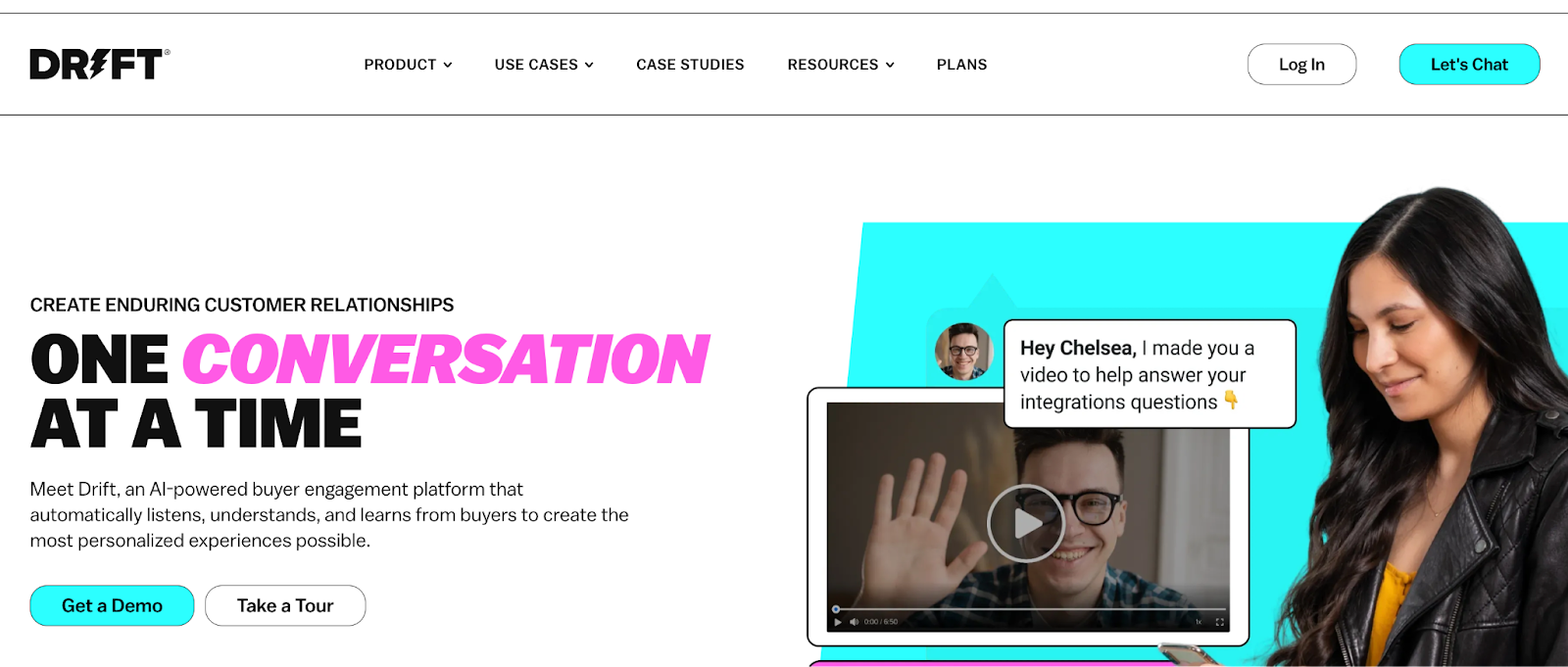
Drift, a live chat platform, invites users to “Take a Tour” as soon as they land on the homepage.

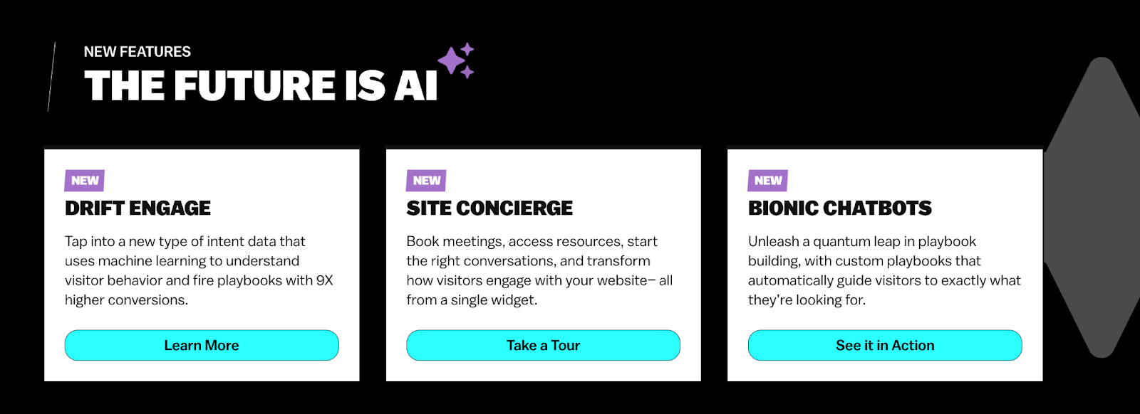
“Take a Tour” CTAs are peppered throughout the site, encouraging users to explore various Drift features for themselves.

Although Drift’s tours aren’t gated, they ask for an email address after a couple of steps — once they’ve piqued a lead’s interest.
Guru
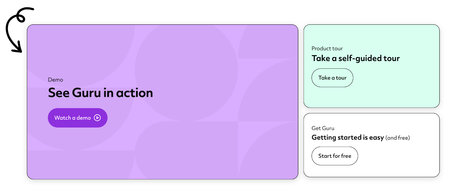
Guru, a secure enterprise search, intranet, and wiki platform, takes a similar approach, inviting visitors to “Take a product tour” or “Take a tour” as alternatives to watching a demo — in several spots on the homepage.


Seven steps into the tour, Guru allows visitors to schedule a demo or continue with the interactive demo.
At the end of the tour, users can either schedule a demo or continue running through Guru’s other interactive demo content, with a handy checklist to guide them to the features they might be most interested in.
Linking Out Tips
- Make this CTA prevalent across the website so people click on it.
- Don’t use similar language to a “Book a demo” CTA. Make it clear that this is a separate offering and they can try out your product right then and there.
Our data shows that the most popular CTA types for interactive demos are: “Take a tour or product tour” (43.57%), “Interactive demo or try demo” (22.86%), “Explore product” (7.86%)
Option #2 (Medium) - Embed On a Product or Use Case Page
Embedded interactive demos tend to get more engagement.
Users don’t have to click off of their current page — the interactive demo is right in front of them as they explore your website.
Embedding tends to be more common for use case or feature pages to show off one part of your product, instead of an entire product overview.
Of course, this option takes a bit more work. You may need some help from your website team to test out the demo embed on an existing landing page.
Website Demo Embed Examples
Dooly
Dooly, a sales enablement platform, is a great example of embedding in action. On its pipeline product page, users get a quick explanation of what the product does and what companies are using it.

Then, they’re launched straight into an interactive tour to show them exactly how one-click pipeline updates in practice.
By the end of the tour, users have gotten a small taste of Dooly’s value and are motivated to book a live demo.
Jellyfish
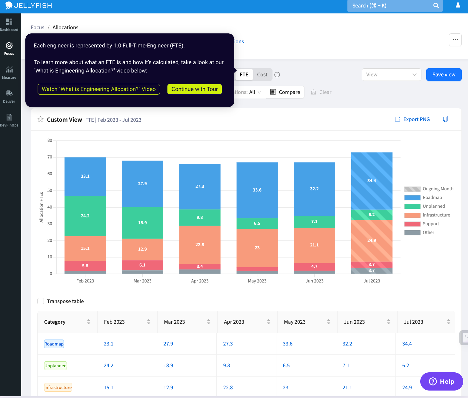
Jellyfish, an engineering management platform, has made a similar choice to Dooly, embedding product tours on most product pages of their website — many times above the fold.
The Allocations product page, for example, starts with a screenshot and some light copy, then launches straight into a product tour that explains how Jellyfish reveals how engineering resources are being invested in real-time.

In the tour, users learn about Jellyfish’s native dashboards and integrations with Git and Jira and get exposed to other content, like videos.

This extra content not only adds context and color to the Allocation features, it also keeps them engaged on the Jellyfish site.
Embedding Tips
- Be sure to embed higher up on the page. Our data shows that demos higher up on the page have 3.5x the engagement rate of those below the fold.
- Try different embed types, like our native scale-to-fill, to see what works best for your software. Remember, this will be a visitor’s first impression of your product, so make sure it looks as good as it can on the page.
Option #3 (Advanced) - Create a Demo Library
Demo libraries are a series of self-guided demos, each focusing on a particular product feature, integration, pain point, or buyer persona.
Option #3 is ideal for more complex products since you can show off several use cases at once.
But to create a whole library, you’ll need multiple demos and a dedicated spot on your website to house them. Most customers start with CTAs and embeds, then gradually move toward a library once they’ve built enough demos.
Creating a baseline template and adjusting it for each new demo can speed up the process.
Website Demo Library Examples
Demandbase
A popular ABM tool, Demandbase, has an extensive demo library that covers all the platform's capabilities, from advertising to sales intelligence to data integrity.

To make it easier to find relevant demos, users can filter by use case or product, ensuring they interact with a tour that applies to their main use case and increasing the chances of conversion.
Sitecore
Sitecore, a digital experience platform, also has a demo library with tours that pertain to each of its products and solutions.

Sitecore’s impressive number of demos shows the depth and breadth of its product suite and helps users hone in on the use cases they care about.
When they talk to a rep, they’ll have a better idea of the features they want and need, speeding up the sales cycle.
And they can schedule a call straight from one of the interactive demos — each has a “Request a personalized demo” button at the top.
Demo Library Tips
- Let users filter your demos by product or use case to get them in the product (and to an aha moment) faster.
- Give users a way to exit out of an individual demo and go back to the library.
- Gain more inspiration from our article, What is a demo center?
Regardless of the option you choose, adding interactive demos to your site will give your buyers more of the self-serve sales experience they want — ultimately resulting in more, higher quality leads.
Looking for other ways to maximize your interactive demos? Consider: