7 Best Interactive Demo Software in 2025 (+Examples)

Head of Growth & Product Marketing
Software companies have been adopting interactive product demos as part of a shift toward product-led marketing.
Every year, we publish a State of the Interactive Product Demo report to better understand:
- What top-performing interactive demos have in common
- The use cases they focus on
- New trends and best practices for demo builders to follow
This year, we found that interactive demos are still steadily increasing in popularity — 10,000 more interactive demos were built in 2024 versus 2023.
In a sample size of roughly 5,000 B2B SaaS websites, 29.2% more B2B websites used a “Take a Tour” CTA on their website last year than the year before.
And, on average, teams are using demos for 5 use cases.
But with more and more companies adopting interactive demos, how can yours stand out?
Below, we dive deeper into what interactive demos are, the different software you can use to build them, and how to build outstanding demos that set your brand apart.
What is an interactive demo?
Interactive demos are a type of no-code sales demo software that gives prospects and customers a hands-on experience — without them ever having to log into your product.
Though they aren’t actually in your product (just in a replica of it), users still get a sense of what your product can do and whether it will serve their use case.
The idea is to arm them with the information and the confidence they need to make a purchase decision and maximize the value of your product.
The best interactive demo software
Below is a summary of the most common software for interactive demos.
- Navattic for mid-market or enterprise companies that want to use interactive demos and their data across their entire GTM motion.
- Storylane for early-stage startups who want to quickly build demos.
- Walnut for templated live sales demos to clone and personalize.
- Reprise for large, complex demo environments for live calls.
- Arcade for short how-to demos for social media or help articles.
- Tourial for Chrome extension-based apps or pre-live production apps.
- Supademo for small teams that want a cheap, easy-to-use demo platform.
Keep reading for interactive demo use cases, best practices, and examples or skip ahead to go straight into the pros and cons for each of these softwares.
Skip ahead to learn about each demo software
When should you use interactive demos?
Because users don’t need access to your product to see it in action, you can use interactive demos across your entire funnel, from first-touch outbound emails to post-demo leave-behinds to upsell and cross-sell campaigns.
At Navattic, we’ve seen our customers use interactive demos:
- To build demo centers where prospects and customers can go through multiple product tours on their own time.
- On review site profiles like G2, TrustRadius, and SourceForge to introduce buyers to your product directly from your product profile.
- For partner training to get partners up to speed on your product.
- In ABM campaigns to customize demos by persona, industry, or use case.
- As sales enablement to create dynamic follow up sales assets.
- At conferences to give live guided demos at your booth.
The best part? You don’t have to worry about users running into bugs or spotty wifi — they’re in a fully controlled environment.
Best practices for building a successful interactive demo
If you have the engineering resources, you could build interactive demos in-house. However, in most cases, using interactive demo software like Navattic is preferable.
It can take six months to a year to build an interactive demo with dedicated engineers. In Navattic, anyone — sales, marketing, CS — can spin up a demo in a few hours. Here’s how:
1. Pick a use case
According to our 2025 State of the Interactive Product Demo Report, the most popular use case for top-performing demos was website embeds (63.8%).
Our data shows that other popular use cases include:
- Feature and product launches (50.0%)
- Demo centers or libraries (44.7%)
- Customer training and onboarding (44.7%)
2. Find inspiration from internal sources
Great jumping-off points for demo content include:
- Sales calls
- Customer calls
- Webinars
- Frequently used slides
- One-pagers
If those don’t exist, host a brainstorming session with your CS, Sales, or Product team to clarify typical user “a-ha moments” — times when users understand exactly how the product will help them and experience the core value of your product.
3. Put together a storyboard
After you’ve reviewed internal materials, it’s time to create a demo outline. Best practices include:
- Keeping each demo flow between 8 - 15 steps
- Incorporating between two and four a-ha moments per demo
- Using both modals and tooltips
- Creating a theme that matches your company branding
- Adding a checklist to organize multiple flows and give users options to choose their own adventure
Once you feel confident with your storyboard, share it with your colleagues and ask for honest feedback.
They have insights that you may not, and making changes at the storyboard stage is much easier than adjusting a live interactive demo.
4. Build and edit your demo
Some people use task batching to cut down the time it takes to build their demos, focusing on the theme or inserting all the CTAs they know they want to include before moving on.
Once you’ve got a foundational demo in place, take some time to:
- Play with various theme colors
- Reposition your tooltips to see if you can offer a better UI
- Refine your copy to encourage users to book a sales call
And if you’d like a second pair of eyes, reach out to us at support@navattic.com to schedule a demo review.
After your demo has been live for a month or two, use Navattic’s native dropoff reporting to see where people get stuck.
Look at your demos with the highest engagement rates and see if you can apply some of the same techniques to your lower-performing ones.
Not sure whether to gate your demo? This blog can help you make your decision.
3 interactive demo examples
To give you some inspiration, we’ve pulled several examples of how companies are using interactive demos on their websites.
Lattice
Use case: Navbar CTA, product pages
Lattice, an AI-powered human resources software platform, uses click-through demos to show potential customers what the tool does and how it can drive performance, engagement, alignment, and compensation programs.
On the homepage, users are invited to take a product tour in a CTA within the Platform section of the nav bar.

The page reloads, and visitors are asked to provide some personal information.
Once the form is filled out, Lattice customizes the tour experience based on whether the user is a manager or HR admin, ensuring they see what they will find most interesting and applicable to their day-to-day work.
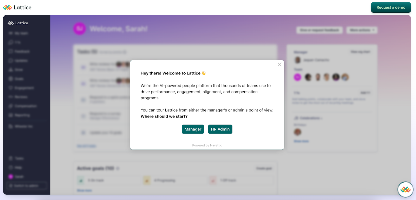
At the end of the demo, users can run through the alternate experience (Manager or HR Admin) — and Lattice tells them exactly what they’ll see — or book a call with the Lattice sales team.
Explore Lattice’s Tour
Vitally
Type: Demo Center
Vitally, an all-in-one customer success platform dedicates an entire section of its website to interactive demos:
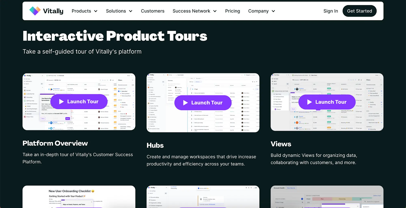
Building a library of various demos and adding filters for each core Vitally feature helps users find and walk through their exact use case.
The demos are fairly in-depth, previewing to users just how much value they could get from the tool, thereby increasing the chances they convert.
Explore the Vitally Academy
Writer
Type: Demo Center
Writer, a generative AI writing tool, takes a similar approach to Vitally, using a whole page of their website to promote interactive demos.
As the user scrolls down, they can see multiple interactive demos showcasing various Writer use cases — from drafting press releases to summarizing earnings calls to creating product detail pages.

Users can easily find the interactive demo they’re most interested in with the industry filters the Writer team conveniently provides on the left-hand side of the page.
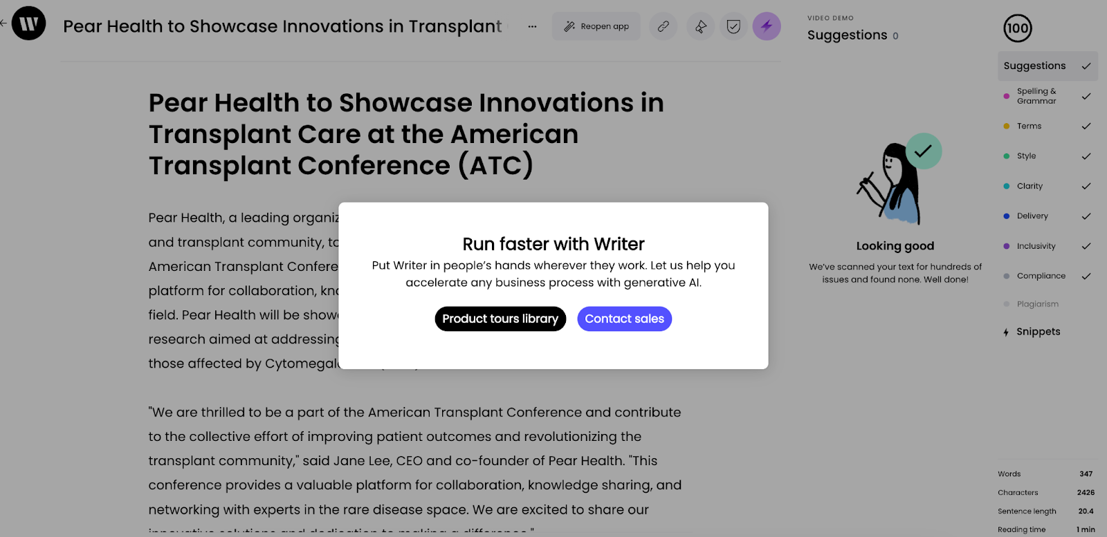
Writer keeps these demos short and to the point, maximizing the chances prospects get through the entire demo and decide to either run through another one or book a call with the Writer sales team.
Explore the Writer Demo Center
Top 7 interactive demo softwares plus pros and cons
Picking the software you’ll use is just the first step in building an interactive demo. If you’re in the market for an interactive demo platform, here are some options to consider:
To keep this article as unbiased as possible, we spoke with buyers who evaluated interactive demo software over the past 6 months. It was a mix of buyers that went with Navattic and with competitors.
We asked them how they went about their research, what their first impressions were, and the pros and cons of each tool in their assessment. We also looked at G2 reviews and Reddit comments.
Navattic
Navattic’s guided HTML/CSS demos enable any product-led or sales-led team (sales, marketing, customer success, partnerships) to create demos — without engineering's help.
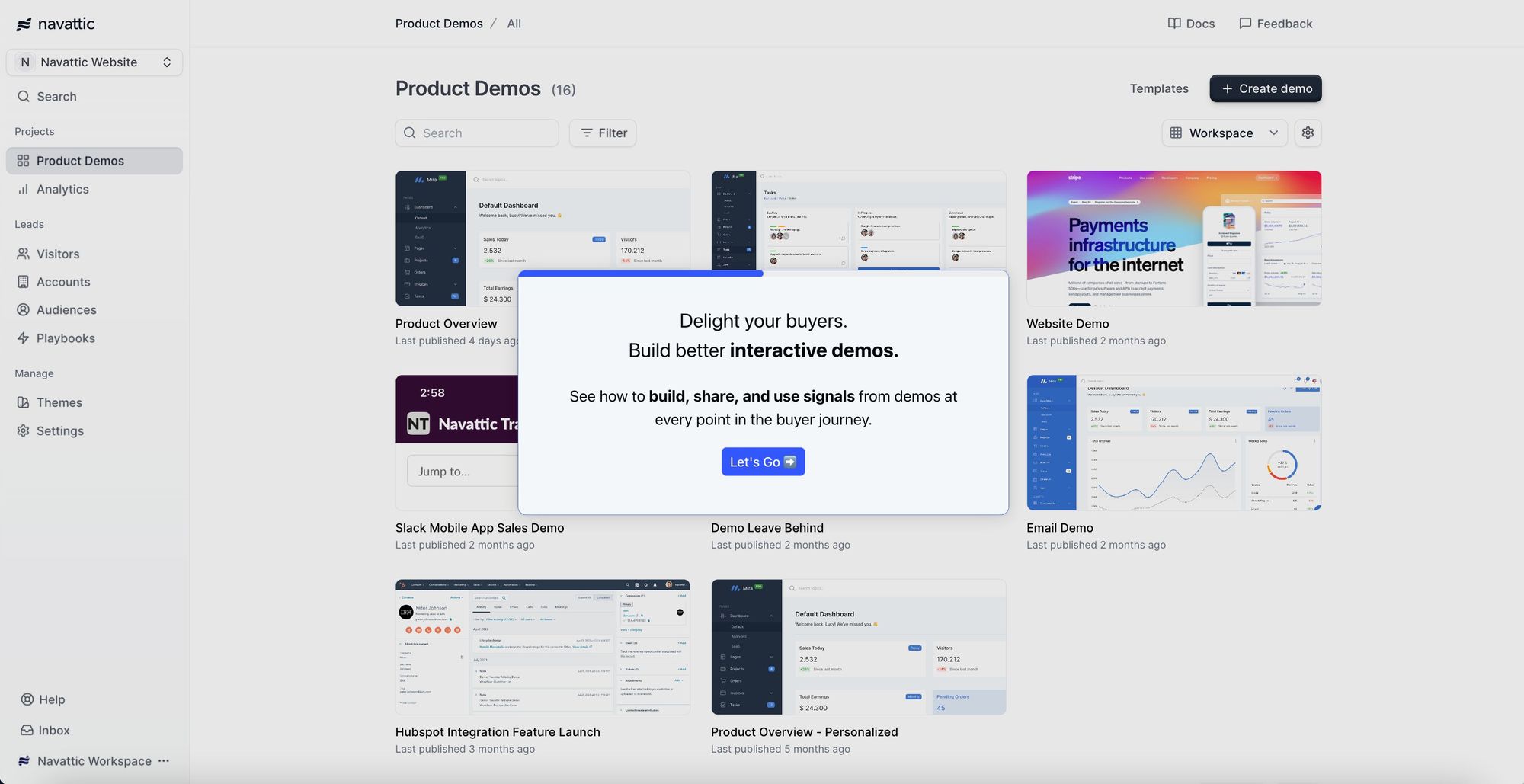
Try an interactive demo of Navattic
Our product supports interactive demo builds for mobile apps, desktop apps, and other web-based tools and integrates with tools in nearly every SaaS company’s tech stack, including Hubspot, Salesforce, G2, Twilio Segment, Marketo, and Google Analytics.
Pros
- No-code: Our product is all drag and drop, making it extremely easy to use. According to one of our customers, “The platform is incredibly easy to use and has thoughtful tools like allowing you to quickly edit out sensitive data and highlight certain components. It was a very low lift (less than a day!) to launch our first demo, embed it into our website, and start tracking leads.” (G2 Review)
- Analytics: The backend of Navattic tracks target accounts interacting with your product, so you can share that engagement data with your entire GTM team for continued targeted outreach.
- Mobile view: Navattic has several viewing options for devices smaller than 800px wide, including smartphones and tablets.
Cons
- Live demo options: Our focus on ease of use and fast deployments means we don’t specialize in overlays or click-anywhere demo sandboxes for live sales calls — those can require a longer technical setup.
- Terminology: Some users report a bit of a learning curve when it comes to interactive demo technology, like flows, captures, modals, and tooltips (G2 Review).
Pricing for 5 users
Navattic’s Base plan is $500 per month.
It comes with unlimited HTML demos, demo views, and integrations, plus conditional demos, custom themes, Navattic JS, in-app demo suggestions, and a dedicated CSM.
Storylane
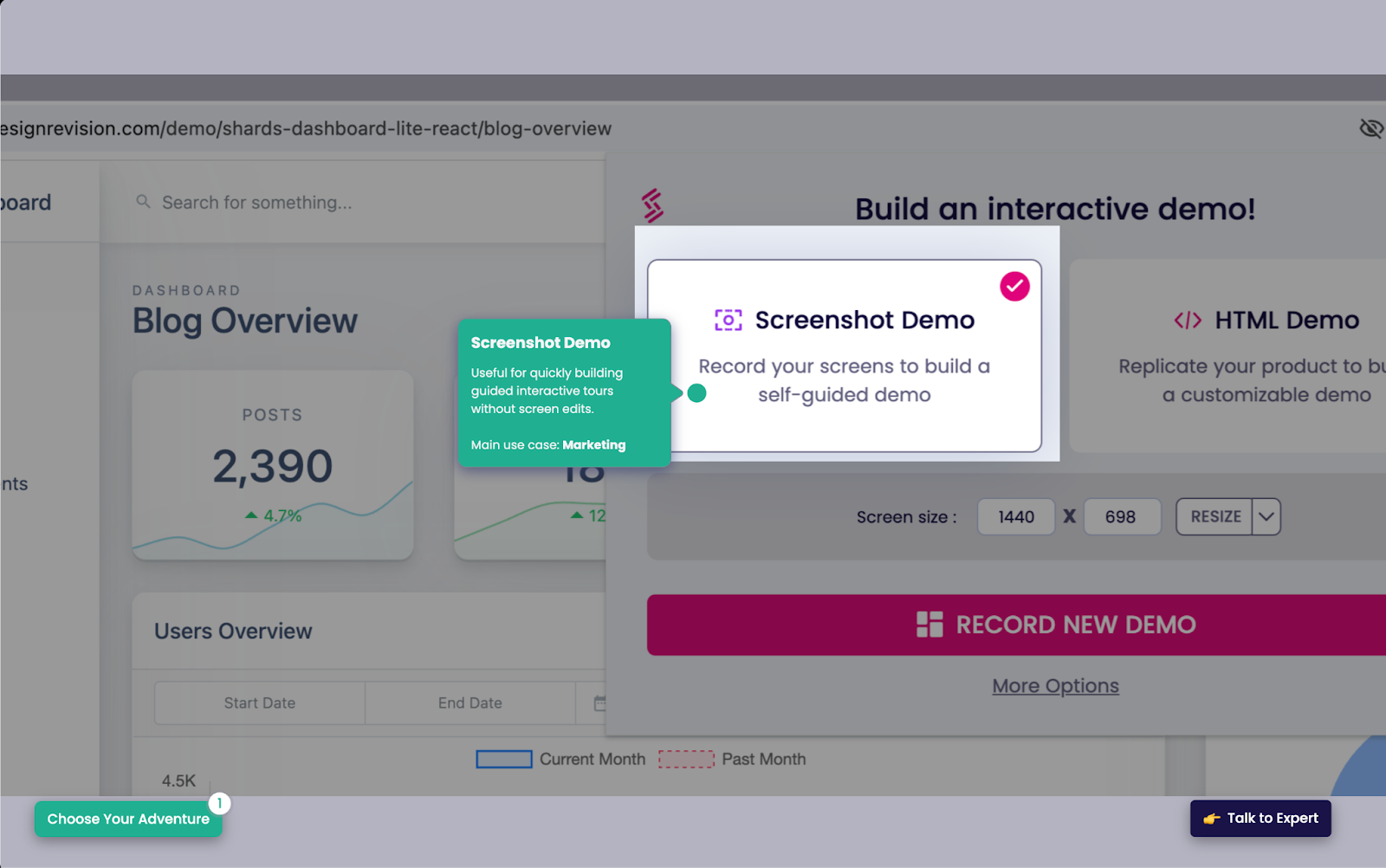
With Storylane’s basic plan, users can create screenshot and video demos, directing users to specific features using text-based prompts. Storylane has some features to help build quick demos, like AI assist, which enriches voiceovers, translation, and copy.
Storylane comes at a cheaper price, but it’s more of a self-serve tool — you don’t get a CSM isn't unless you go with their $1,200 minimum plan.
Pros
- Demo Hub. Though Ignacio Harriague at Invgate didn’t end up going with Storylane, he shared: “Being able to build playlists or a gallery of demos so that prospects can pick and choose what they wanted to see was interesting. But we don’t sell too much into big enterprises where this would be useful.”
- Account reveal feature. “It’s loved by our sales team to see who is interacting with the demos on our website.” (G2 Review)
- Always visible CTA that can boost conversions “by keeping the call-to-action front and center.” (Reddit)
Cons
- No HTML without a more expensive plan. Storylane customers don’t get a demo HTML editor, personalization, support, clickable live demos, or certain integrations unless they choose the $100 per user per month Growth plan.
- Lack of support. Nabilah Salleh at a customer communication platform went with Storylane but mentioned: “The help centers were lacking information.”
- Lack of analytics. Users say, “Would love to get clearer insights into which of our customers engage with the Tutorials we create,” and “The analytics part could be more intuitive for the administrator to make better calls on what to improve in the demo experience.” (G2 Review, G2 Review)
Pricing for 5 users
$500 per month.
With the Growth plan, you get an HTML-guided demo, personalization (names, logos, dates, etc.), embedded lead forms, 10 integrations, 2,500 deanonymized visitors, and support.
See our comparison landing page to learn more about Navattic vs Storylane.
Walnut
Walnut captures your product's front end with a Chrome extension and then allows users to edit and personalize through a no-code interface or HTML.
Once a user finishes creating their demo, it’s added to a shared library, which can be categorized, saved for future use, or cloned and updated for a live call.
A distinguishing characteristic of Walnut is that prospects can leave comments and questions as they go through a demo. AEs can respond asynchronously or use those comments as an entry point for another sales call.

Pros
- Engagement. Prospects can leave comments and questions as they go through a demo, and AEs can respond asynchronously or use those comments as an entry point for another sales call.
- Shows off your integrations. If your product integrates with another software, you can capture both platforms and demo how they work together. “It helps showcase integrations with other platforms that often require SCs (clickthrough with a script they can follow). Has considerably cut down SC requests.” (Reddit)
Cons
- Limited support for mobile apps. Walnut’s Chrome extension only works on web-based products. Users say, “Support for mobile apps is a little convoluted, but they seem to be working on it,” and “We had some difficulty building Walnut demos from a mobile point of view because the platform only allows us to take screen captures from a web browser.” (G2 Review, G2 Review)
- Limited integrations. Walnut doesn’t have native integrations to Segment, Adobe Analytics, Mutiny, Amplitude, or Mixpanel.
- Getting up to speed takes time. “Other tools tend to have certain, what seems to be basic, functionality that Walnut lacks or requires customization. The building experience takes a bit longer to grasp, though a recent update has made it a bit easier.” (G2 Review)
Pricing for 5 users
Walnut charges a flat platform fee, though it’s unclear how many users are available in each of their three plans. Their Lite plan is $9,200 per year, with:
- Unlimited demos and website embeds
- Demo analytics
- HubSpot integration
- Walnut Uncover
- Playlists
For a dedicated CSM, expert technical training, and integration with Salesforce, the platform fee skyrockets up to $20,000/year.
Reprise
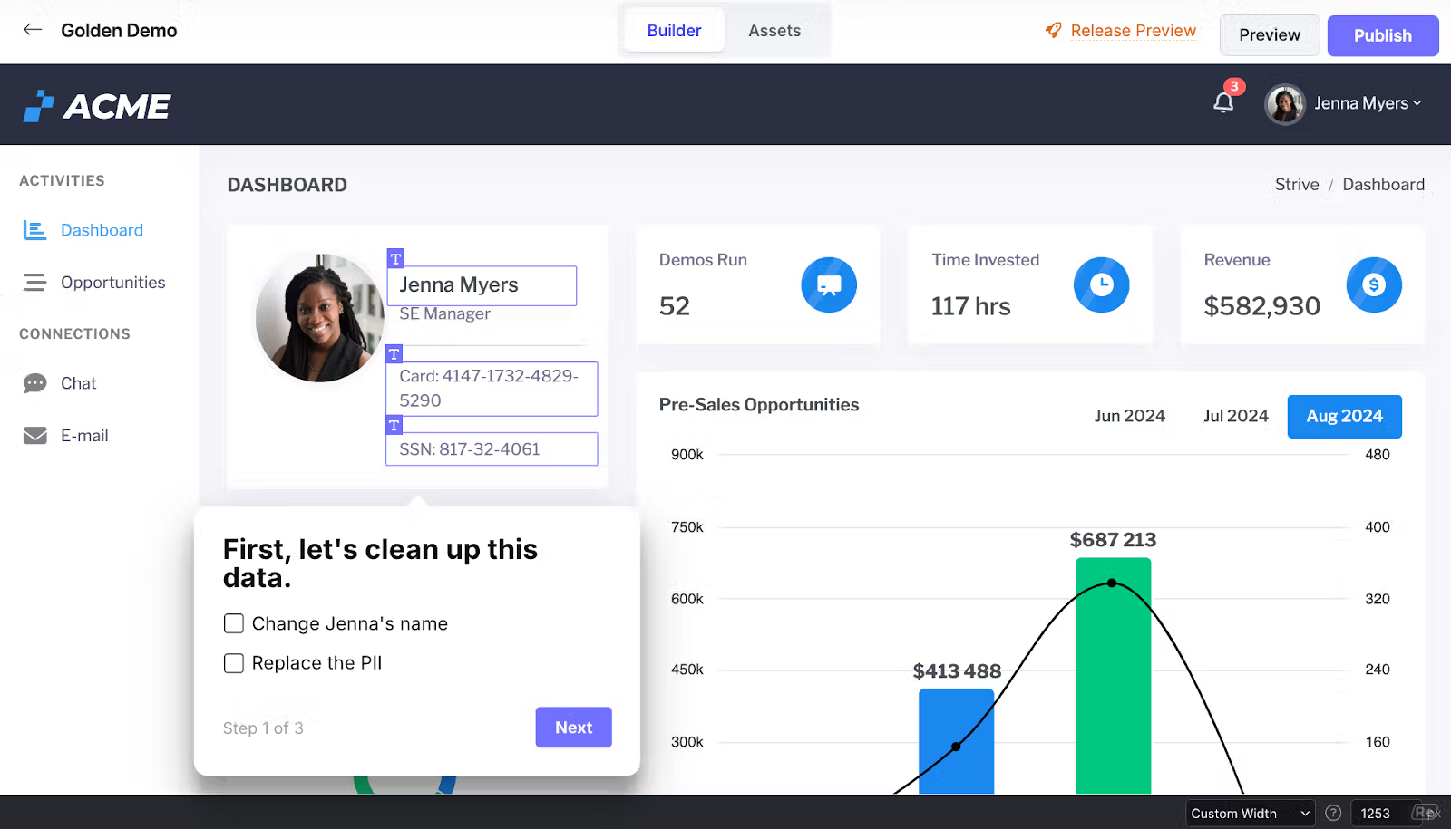
In Reprise, users can build three kinds of demos: guided walk-throughs, live overlays, and cloned sandbox environments, so it makes sense for companies that need all three and want to centralize demo creation.
That said, its complexity can steepen the learning curve for marketers, SEs, and AEs, and often requires engineering help. Like other sandbox demos, it opens you up to the same errors you could get in a live environment.
Pros
- Supports large, complex demo environments for companies like Zendesk, MongoDB, and Databricks.
- Good customer service. “The customer and engineering support from Reprise has been helpful, and they have been able to accommodate specific use cases that required custom code.” (G2 Review, G2 Review)
Cons
- Takes a while to get up to speed. According to G2, Reprise is “slower to reach ROI” than Navattic and other presales tools. One user said, “To utilize all of its features, all of its capabilities, it takes time to learn. There are some rather more technical pieces to it as well that require more specialized knowledge.” (G2 Review)
- Lack of marketing features. “I find myself wishing it had more features that helped with end to-end top of funnel tracking for SDR, BDR, etc.” (G2 Review)
Pricing for 5 users
Reprise does not publicly share its pricing, but they don’t tend to work with companies with less than 200 employees. Expect enterprise-grade pricing.
Arcade
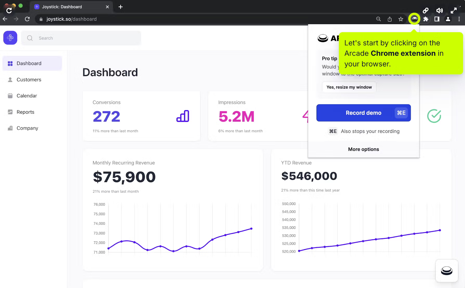
Arcade is easy for GTM teams to use. They just record video and audio clips through Arcade’s Chrome extension. The platform also has workflow and collaboration features to get team members on the same page and help them work on demos efficiently.
Editing screenshots and videos manually takes time and resources, though, and Arcade charges extra for trimming, speeding up, and editing their videos.
Because of the static nature of these demos, Arcade is better suited to quick, how-to demos than longer demos intended to show the full scope of a product.
Pros
- Taking screenshots and videos is quick and easy to do. “It’s very intuitive, easy to use and beautiful. It’s my preference of choice in recording interactive demos.” (G2 Review)
- No responsiveness issues. Because it’s a video-based tool, you don’t have to worry about responsiveness or mobile availability. “There are lot of options how to modify what kind of things you want to show during the path what potential customers are going through on your web pages.” (G2 Review)
Cons
- Missing integrations. Arcade doesn’t integrate with Chili Piper, Marketo, Zapier, Zoominfo, and customer email clients.
- Doesn’t support forms. Arcade doesn’t support HubSpot custom forms. (G2 Review)
- Lacks analytics features. Per one user, “I think there's more room to use analytics - I've not experienced this part of the product much but [we could use] more clarity into generating our ROI.” (G2 Review)
- Arcade is only available in Chrome. “It’s a helpful workhorse for most use cases but I would love the ability to run it on my computer or via other web browsers in the future.” (G2 Review)
Pricing for 5 users
$213 per month ($42.50/user/mo) for advanced reporting, forms, integrations, translations, video editing, pan and zoom, insights, and advanced branching features.
Tourial
Tourial customers use screenshots and video capture to create product walk-throughs. A notable Tourial feature is their “TourPlayer,” which lets you build a playlist of demos for particular segments of your ICP.
While Tourial’s video-based tours showcase mobile and Chrome extension functionality, drag-and-drop, and other actions that HTML capture can’t pick up, these graphics are static, meaning demo builders can’t easily edit or personalize their demo environment data.

Pros
- Microsites. You can build demo center microsites with prompts so that users can find the right demo based on role or use case.
- Tourial Studio services. Enterprise plan customers get demo “glow-ups,” attribution, web design, and personalized workshops.
- Integrations to routing tools. Tourial has built-in connections to Calendly and Chili Piper to streamline the interactive demo to sales call flow.
Cons
- The UI is a little clunky. “Some weird workarounds that need to be used to achieve certain things. Browser plugin not reliable.” (G2 Review) “I’ve used Tourial and while it’s fine, I am not fond of the UX.” (Reddit)
- Poor support during the sales cycle. “Their team was unresponsive to our questions and helping us set up the platform,” Nabilah Salleh at a customer communication platform points out. “Also to try out the platform, we needed to contact their sales team, which is rather difficult due to the time differences.”
- Mobile compatibility. Reviewers say things like, “My only issue so far is sometimes tours not being as user-friendly on mobile devices,” and “Would love the mobile experience to improve.” (G2 Review, G2 Review)
Pricing for 5 users
Tourial has three plans but does not advertise the cost of each plan, nor how the pricing works (per seat, platform fee, etc.).
For five users, you’re probably looking at their Growth plan, which comes with standard and advanced integrations and personalized training. Demo centers and SAML/SSO can be added on for an extra fee.
Supademo
Supademo’s screenshot and video demo-based platform is designed to help marketers and sales folks create and share demos quickly.
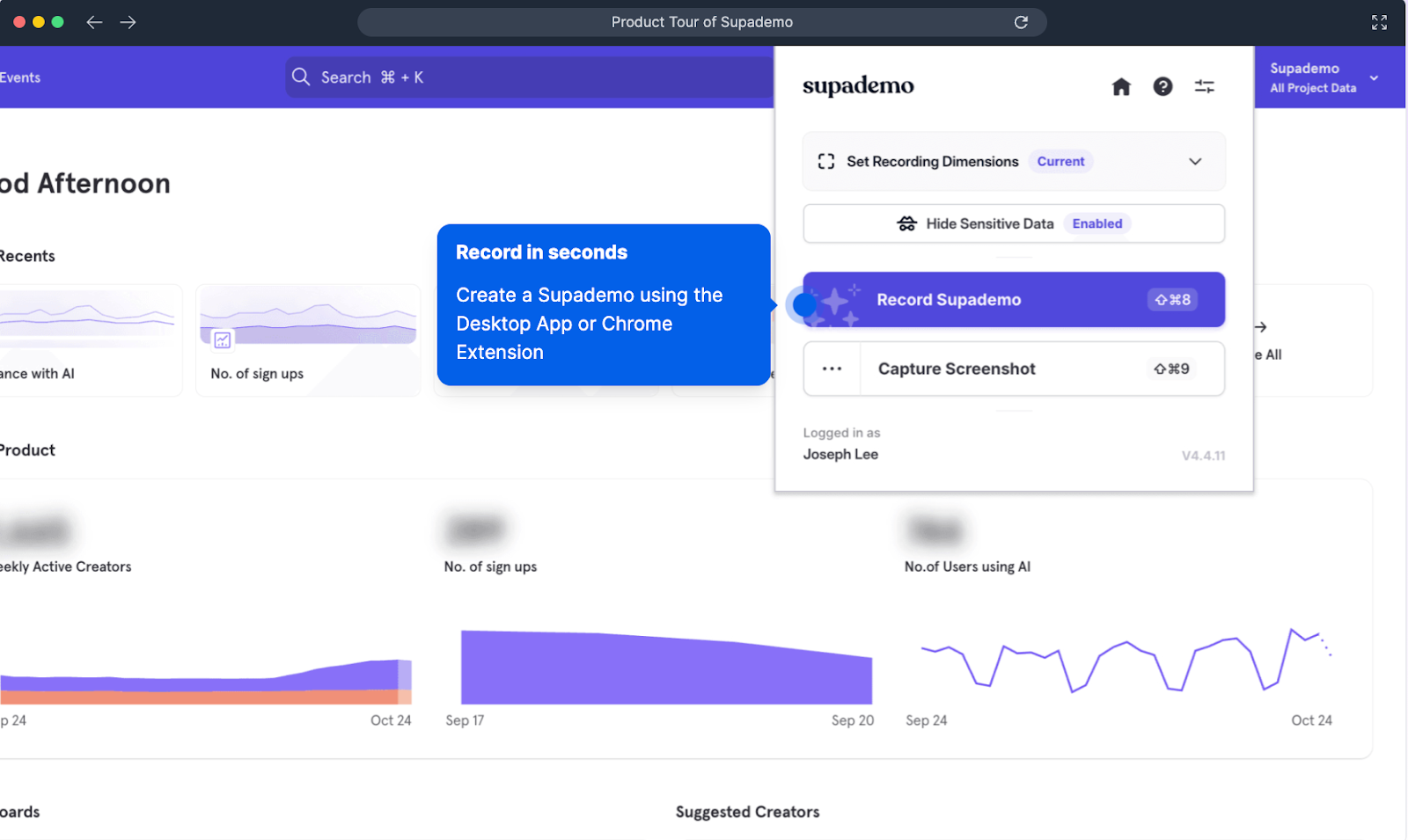
Users can record workflows across web apps (via a Chrome extension), desktop applications (through a dedicated desktop app), and mobile apps (by uploading screenshots).
What’s unique about Supademo is its incorporation of AI. If you’re on one of their paid plans, you can use Supademo AI to enhance your voiceovers, translate them into 15 languages, and auto-generate copy for tooltips.
Pros
- A good alternative to product videos. “My team has been using it to create tutorials and onboarding resources for our user guide. Before Supademo, we had huge issues keeping those resources in sync with updates to our software because videos take so much time and effort to produce.” (Reddit)
- AI features that accelerate time to value. “The AI-powered features are excellent for personalizing demos, making them highly engaging and tailored to our requirements.” (G2 Review)
- Figma plugin to add voiceovers, CTAs, forms, and animations into click-through designs.
Cons
- It’s new. Supademo is one of the newest products on the scene — founded in January 2023 — and users report they are still working out some kinks.
- Demos can cause other parts of your site to lag. “It seems to slow down site speeds, so I can't put this everywhere on my website that I'd like to.” (G2 Review)
- Doesn’t have HTML captures. According to their website, this functionality is “coming soon,” and you have to request beta access.
- Buggy AI features. “It's really missing some way to add audio while you're recording the video and then take those instructions, transcribe them, summarize and use the AI voiceover. By default, the AI just says "click the next button", etc., which isn't all that helpful if you're trying to do a help doc and explain features as you are walking through them.” (G2 Review)
Pricing for 5 users
Scale is Supademo’s most popular plan. It starts at $38 per user per month, $190 per month for 5 users.
You get unlimited demos, Supadmo AI, custom branding, dynamic variables, trackable share links, integrations, and conditional demo branching.
Curious to see Navattic in practice? Create a free Navattic account and start building your interactive demo today.