Product Walkthroughs vs Product Tours (+The Tools You Need)

Head of Growth & Product Marketing
The terms “product walkthroughs” and “interactive product tours” are often used interchangeably. But they’re not the same — they appear in different places and have different functions.
A product walkthrough is a form of product onboarding in which a user is guided through a series of predefined steps within a mobile or web app. Each step explains what the product does and/or how it works.
Interactive product tour software provides prospects and customers with a hands-on experience of your product. Unlike product walkthroughs, interactive product tours are sharable replicas of your product (not within the product itself).
Below, we’ll share more about when and why to use each, how to use them together, and our top software picks.
When to use product walkthroughs
Product walkthroughs for free trial to paid conversion rates and user onboarding and activation rates
The best time to use a product walkthrough is when a user logs into your product or a free trial instance for the first time.
Push them to conversion or encourage adoption by:
- Segmenting users based on their knowledge of the tool or expressed interest in a specific use case, then take them through the most relevant first steps.
- Directing their attention to certain features or use cases with tooltips or overlays.
- Asking them for feedback once they’ve been onboarded to your tool so you can enhance your walkthrough over time.
Why use product walkthroughs
Your users are getting stuck
To get the most out of your tool, users have to know how to use it. And sometimes, email sequences, docs, and videos just don’t cut it.
Product walkthroughs aren’t a step removed from your product — they actually hand-hold prospects and customers while they’re in your product, describing each feature and answering FAQs as the user becomes accustomed to the software.
Channeltivity, a channel management software, uses a product walkthrough to show new users where to find each aspect of their platform.
The walkthrough automatically launches the first time anyone (whether they are admins of Channeltivity or partners accessing their portal) logs in, helping them get their bearings.

This product walkthrough shows admins how easy it is to configure Channeltivity, and points channel partners directly to where they need to go to gain value from Channeltivity right away.
Your product has a more complex setup process
Most SaaS products need some configuration out of the box. To users, that setup process can seem long and complicated.
But it doesn’t feel as difficult when you’re walking them through it step by step. A product walkthrough can clarify each part of the process and explain how it connects to the bigger picture.
Project management tool Asana uses product walkthroughs to help users create their first project:
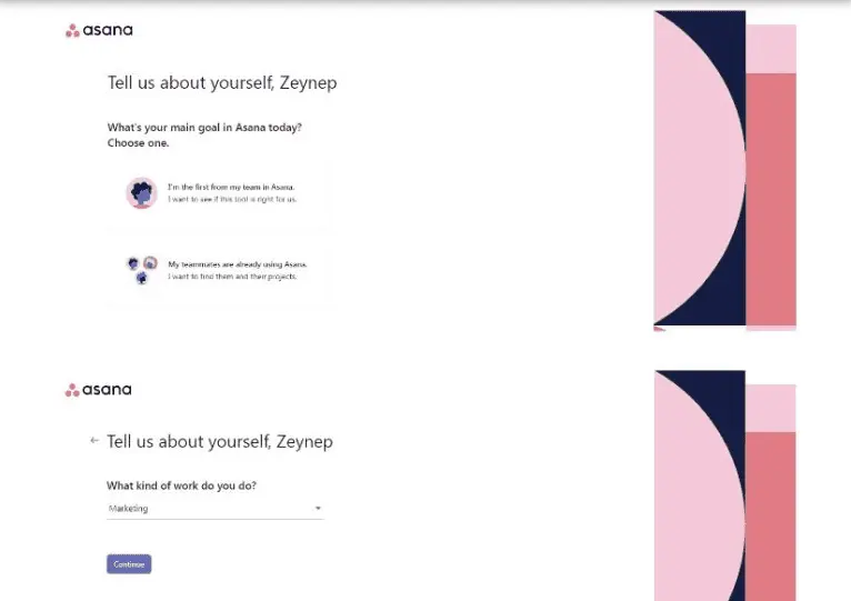
As users answer questions, Asana funnels them to templates that are a good fit for the type of work they’re looking to do.
Once users choose a template, Asana points out other key features using tooltips and hotspots, helping users make their projects more streamlined and ensuring they start off on the right foot.
You want to introduce new features or UI updates
A new UI or new feature can disrupt a customer’s flow so much that they just ignore it.
A product walkthrough can show users exactly how the new feature works and the benefits of incorporating it into their workflow.
Adobe Premiere Pro does this well. Whenever there is something new to share, they use hotspots to acquaint users with new workflows and highlight potential use cases.
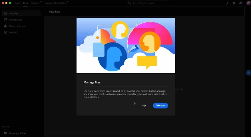
These contextual flows not only help users understand why new features were released but equips users to implement them.
When to use interactive product tours
Interactive product tours for website conversion rates and free trial onboarding and activation rates
Because interactive product tours don’t take place inside of your app, they’re much more versatile.
Instead of having to log into an app to see how it works, users can access interactive product tours on websites, in email campaigns, or on social media.
To make the most of interactive product tours, be sure to:
- Design and share your tours strategically. Spotlight a specific use case or value prop depending on where prospects are at in your funnel or in their customer journey. If your demo ends up being on the long side, use a checklist to split it into concrete step-by-step lists.
- Keep them short. Our customer Pulkit Sachdeva recommends sticking to the golden mantra: “As long as it needs to be, as short as it can be.” Stick to your product's key desirable outcomes and the actions that activate your users.
- Place CTAs throughout your tour. Encourage users to sign up for a free trial or demo or point them to a more lightweight way to engage with your brand, such as listening to a recent webinar or downloading a whitepaper.
- Review your demo analytics. Learn more about how your prospects or customers are interacting with your demos to (1) identify areas they might be getting stuck and (2) tailor future communications with them based on their behavior.
- Use a naming convention for each step and capture. Keena Desai at Fivetran does this to save time when creating new demos and to standardize her analysis.
You have a complex product, and users may not be ready to jump into a free trial
Software for backend functions like cybersecurity or finance can be challenging for users to pick up, particularly in a free trial.
Plus, users may not want to give away sensitive company or financial information in a free trial.
Product tours can educate users about how a product works before they commit to a free trial or freemium subscription.
Ramp, a finance automation platform, uses its interactive product tour to show how Ramp’s corporate cards work.
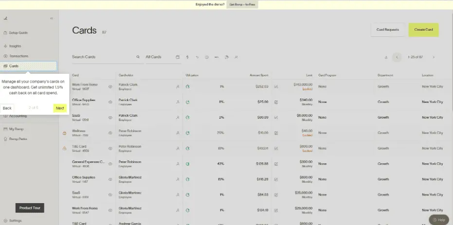
It goes through how the Ramp platform can help them pay bills, automate their accounting processes, and report on their finances — without having to log into any tool or give any of their corporate data away.
Andrew Capland, Founder of Delivering Value, used Ramp as an example for his clients, showing them how Ramp limits the amount of “stuff” users have to provide before getting any tangible value.
Rather than taking information from your customers or prospects upfront, give them room to play around with and understand your product before diving headfirst into your platform.
You want to start teaching users how to use the product in less training
Product enablement falls on the shoulders of the busiest people at a company: sales engineers and customer success managers.
But you can save them from repeating the same content over and over by exposing prospects and customers to interactive product tours. You can even create a series of slightly different tours customized to each persona.
Mixpanel, a user analytics platform, does a fantastic job of this, making users aware of what Mixpanel is and what it does.
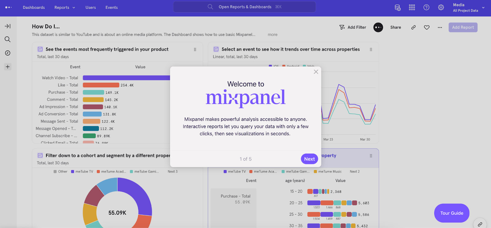
As users continue through the tour, they learn how to visualize engagement trends, build ad-hoc funnels, and spot key retention drivers — all key components of the platform.
At step 6, they’re prompted to continue the tour or sign up for a free trial and try out what they’ve learned.
No one on the Mixpanel team has to spend time talking about each of these features in detail. Users just go through the tour, sign up for a free trial, and practice on their own time.
You want to show complex parts of your product
B2B SaaS tools are typically just one piece of a company’s tech stack — to see their full value, you have to integrate them with other core technology. Trying to get users to do the work of connecting a new tool to downstream apps is a big ask with a free trial or freemium plan.
Interactive product tours, on the other hand, can give users a preview of the integration process and the value it can bring.
Fivetran, an automated data movement platform, created multiple demos — one for each major integration — and stored them in a publicly accessible demo center.
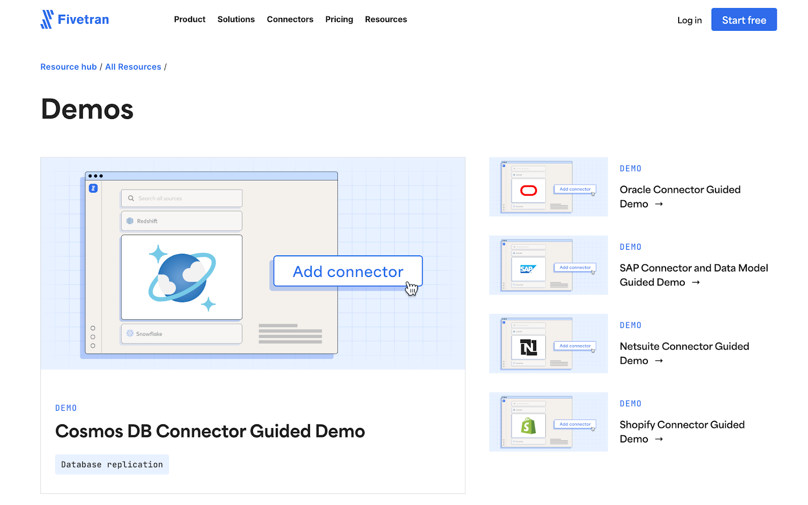
Showing users how to configure integrations not only reduces customer support load, it also piques the interest of prospects who would potentially use that integration in their workflows.
Plus, each of the Fivetran demos has a gate, making it easy for their team to (1) see which prospect profiles are most interested in each integration and (2) send a personalized follow up.
How to use product walkthroughs and interactive product tours together
Product walkthroughs and interactive product tours usually have different goals. But they can be used together to enhance the user experience.
To improve your free trial activation rate, for instance, you may need to convince your free trialers that the setup is worth it.
Embedding an interactive demo in your onboarding experience can help users immediately hit a-ha moments, giving them the extra push they need to get started.
Our Chameleon integration makes it easy to create onboarding flows with the option to “Take a Tour” or “See Demo” before diving in.
You don’t even need your engineering team — just copy and paste Navattic embed code into any Chameleon Experience.
Another way to use interactive product tours and product walkthroughs together is to re-engage users who are stopped in the middle of a free trial.
Add interactive demos to your onboarding email sequences to get users back into the trial instance and experience a full in-app walkthrough.
When the marketing team at Monitor QA added interactive demos to their onboarding email flow, they “saw an increase in people ultimately setting up their free trials than before.”
Even better, the addition caused a “dramatic decrease” in abandoned trial accounts, to the point that “it’s no longer a pain point on our radar.”
To prompt even more engagement, you could also add an exit intent pop-up that links out to an interactive demo after a certain period of inactivity or when users hit a particular stage in their free trial.
The best product walkthrough & interactive product tour software
Now you’ve got the information you need to get started with product walkthroughs and interactive product tours – you just need a no-code tool to help you. Here are five options:
Navattic
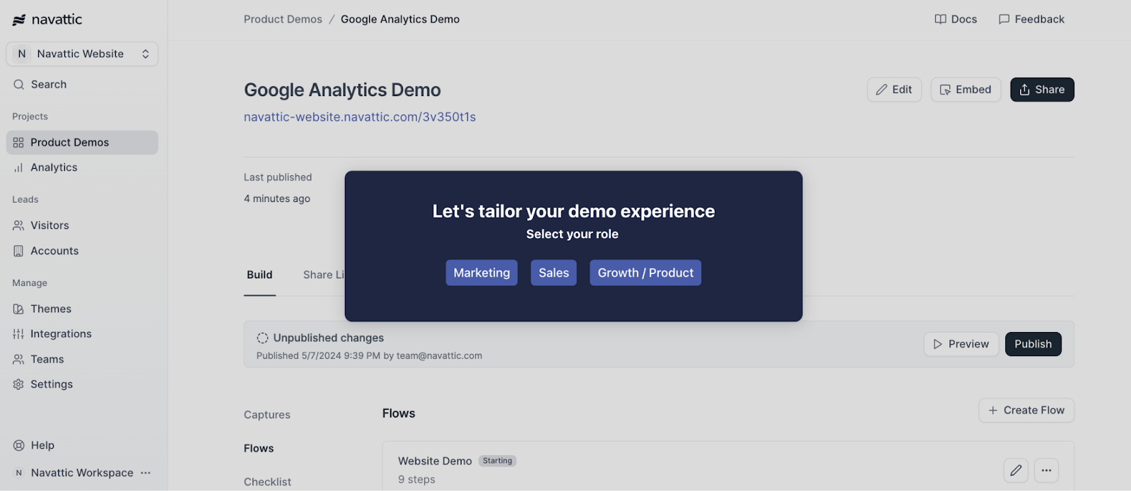
Navattic empowers any go-to-market team member to assemble a custom interactive demo with overlays, tooltips, and checklists.
Navattic’s customers add product tours to their homepage and product pages to get users to understand how their solution works and visualize it for their particular use case, ultimately speeding up the sales cycle.
Category: Product Tour
Pros
- Navattic demos can be used pretty much anywhere — in marketing materials, sales outreach and leave-behinds, partner training, new feature launches, and customer onboarding — without having to give users access to your product.
- It’s easy for users to create one template and then copy and adjust it to fit each customer or prospect’s unique needs.
- Navattic Engage tracks target accounts interacting with your product and allows you to share that data with your entire GTM team.
Cons
- Navattic demos aren’t embedded in or a copy of your actual product, so you have to update tours as your product changes over time.
- They are guided, so users can only explore the preset paths you created.
Pricing
We have four pricing plans at Navattic, including a freemium plan:
- Starter: $0/mo, which gets you 3 builder licenses, 1 HTML demo, and unlimited demo views
- Base: $500/mo, which gets you unlimited HTML demos, unlimited integrations, demo analytics, in-app demo suggestions, and a dedicated CSM.
- Growth: $1,000/mo, which gets you account engagement, advanced filters, in-app collaboration, custom domains, SSO and directory sync, and demo translation.
- Enterprise: Talk to sales. This plan gets you offline demos, a sales demo portal, audit logs, priority support, and expert demo consultations.
UserGuiding
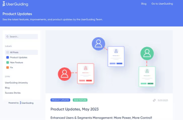
UserGuiding is a SaaS platform that onboards users by prompting the right in-app actions for their familiarity level. The no-code platform allows admins to track hotspots, add interactive manuals, and even send NPS surveys.
Category: Product Walkthrough
Pros
- Built-in segmentation features and customizable templates to make product walkthroughs even more personalized.
- Spurs upsells and upgrades by ensuring the right users see the right thing at the right time.
Cons
- Some users note that UserGuiding’s UI can be confusing (G2 Review) and that you may need CSS and HTML knowledge (G2 Review) to get UserGuiding running the way you want it to.
- Users need access to your product to learn what it can do through UserGuiding.
Pricing
UserGuiding has three plans:
- Basic: $69/mo, which gets you access to the fundamental feature set as well as email and chat support.
- Professional: $199/mo, which gets you unlimited guides, hotspots, checklists, white-labeling, and dedicated support.
- Corporate Plan: Talk to sales. This gets you fully customizable walkthroughs with CSS, coaching, and SSO.
Chameleon
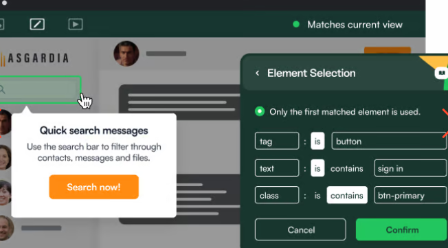
Chameleon is the deepest product adoption platform that gives modern SaaS teams the most control, configuration, and customization to win with in-product UX.
Category: Product Walkthrough
Pros
- Chameleon helps users provide better onboarding through all kinds of features: Tours, Tooltips, Launchers, Microsurveys, and a HelpBar — and all of them are configurable without developer support.
- Users can AB test and easily analyze Experience performance to help them iterate fast.
- Chameleon integrates with Navattic, enabling users to combine interactive demos and product walkthroughs.
Cons
- While Chameleon does have some interactive demo functionality, their focus is on product walkthrough when users are already in your product.
- Customers complain about an “odd” UI/UX (G2 Review) and a difficult setup (G2 Review) for its native segments feature and Mixpanel integration.
Pricing
Chameleon has four pricing plans:
- HelpBar: $0/mo, which gets you CMD+K search inside your product, native fonts, Help Center integrations, and AI answers to user questions.
- Startup: $279/mo, which gets you HelpBar with targeting, unlimited tours & tooltips, 5 microsurveys, 1 launcher, and custom CSS.
- Growth: $1,500/mo, which gets you A/B Testing, rate limiting, unlimited goals tracking, and customer success.
- Enterprise: Talk to sales. This gets you unlimited seats, roles and permissions, localization, account switching, and contract redlining.
Appcues
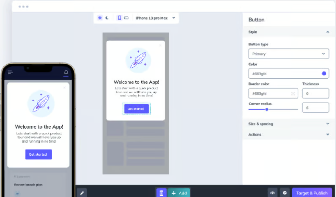
Appcues is a product walkthrough vendor that displays on desktop and mobile apps by installing an SDK or integrating with a CDP, such as Segment.
Appcues admins can build their own product walkthroughs and then measure in-app behaviors through the Appcues Studio application.
Category: Product Walkthrough
Pros
- Any Appcues user can build walkthroughs with slideouts, tooltips, and hotspots via a Google Chrome extension.
- Personalized flows and targeted checklists can guide new users straight to a-ha moments, decreasing the time it takes for them to get value from your product.
Cons
- Users report a “wonky” editing interface (G2 Review) and unstable integrations to other tools like Salesforce (G2 Review).
- Reporting (G2 Review) and lack of clear documentation (G2 Review) seem to be other customer pain points.
Pricing
Appcues has three pricing plans:
- Essentials: $249/mo, which gets you 3 team members, flows, surveys, NPS, and persistent icons and buttons, 5 audience segments, 10 Track Events, and email support.
- Growth: $879/mo, which gets you 10 team members, checklists and resource center, unlimited audience segments, unlimited Track Events, unlimited integrations to 30+ tools, and customer success support.
- Enterprise: Talk to sales. This gets you unlimited team members, advanced security and SSO, roles and permissions, localization support, premium support and services, and access to activity logs for security auditing.
Loom
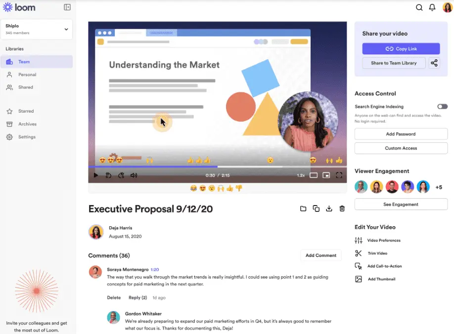
Loom is a free screen recorder that enables teams to create videos that showcase new features or refresh users’ memories of old ones.
It also makes the learning process more exciting, with a friendly face guiding you through the product.
Category: Product Tour
Pros
- Creating a video is as easy as downloading a Chrome extension. Users can film themselves and anything they want to share on their computer screen in a matter of seconds.
- Loom users can point out specific features with overlays and text in the post-production process.
Cons
- Loom videos aren’t interactive, so they don’t give users the feeling that they’re actually using your product.
- Editing Loom videos to show your product in an ideal light can take time away from talking to customers or creating other content to improve conversion and adoption.
Pricing
Loom has four pricing plans to choose from:
- Starter Plan: $0/mo, which gets you a 5-minute recording limit and 25 video limit.
- Business Plan: $12.50/creator/mo, which gets you unlimited recording time & storage.
- Enterprise Plan: Priced per member account at a custom rate depending on volume. This plan gets you advanced admin & security features.
- Education Plan: $0/mo for verified Education users, which gets you unlimited video storage.
Ready to start building product tours? Sign up for a free Navattic account today.