Customer Show + Tell: Website to Free Trial Conversion with Federica Felicetti

Head of Growth & Product Marketing
About this series:
We spoke with the builders whose interactive demos were part of the top 1% of top-performing interactive demos from our State of the Interactive Product Demo 2024.
See how Federica Felicetti at Sibill uses Navattic interactive demos to convert website visitors to free trials.
How do you use interactive demos at Sibill?
Sibill is a platform that assists SMBs with financial control, specifically with cash flow management. We offer various utilities, features, and tools to help businesses maintain control of their treasury.
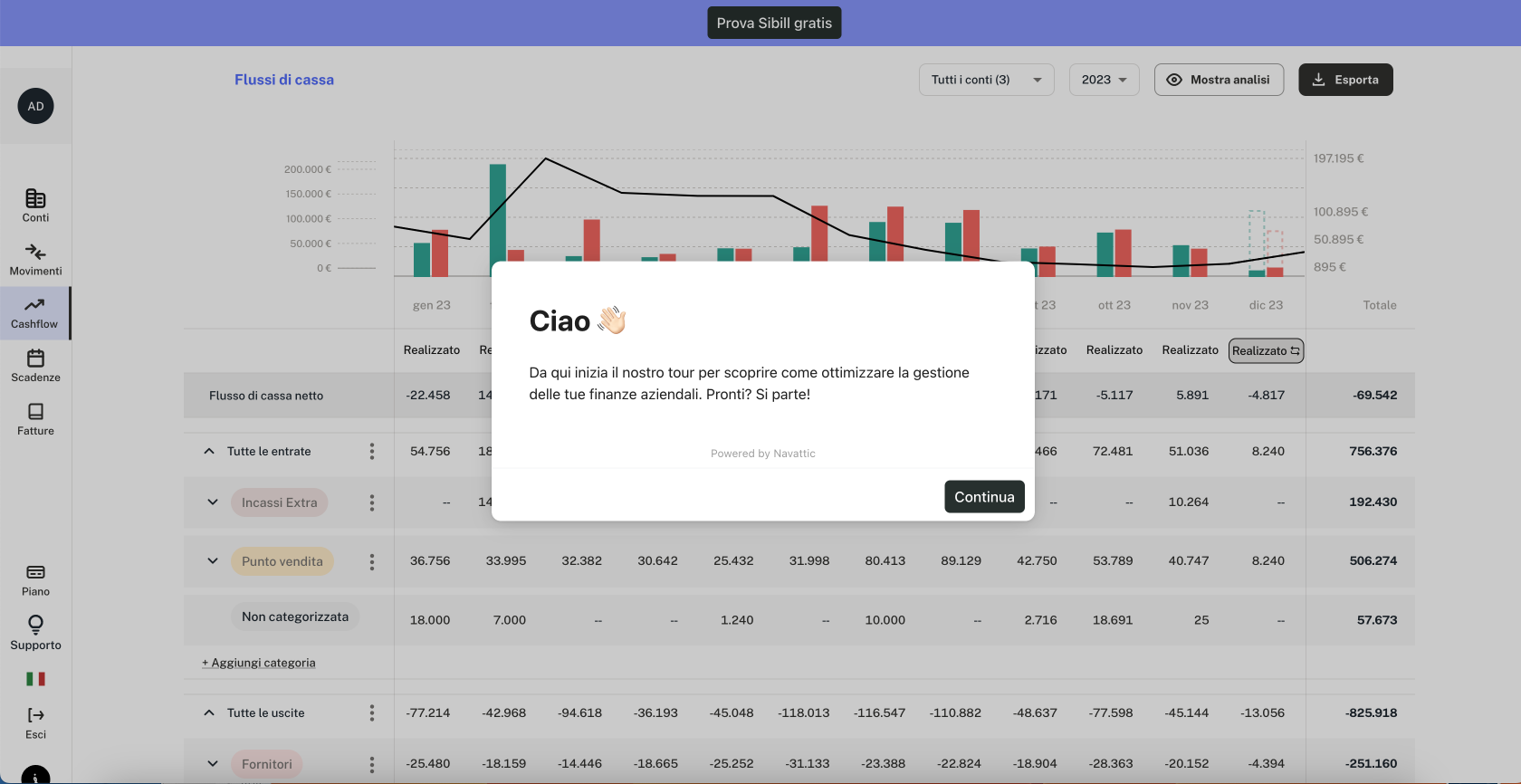
We utilize Navattic to capture leads interested in trying Sibill. While we offer a 7-day free trial, prospects often want to see how our platform works beforehand.
Our interactive demo initially required an email address to access, but we're experimenting with making it ungated.
After viewing the demo, which consists of four or five slides, individuals can choose to start the free trial on their own or request a live demo with one of our account executives.
Could you elaborate on the decision to test gating the demo?
Initially, we opted for a gated approach with our Navattic demos to boost our lead collection, especially at the onset of our journey.
Gated content seemed a viable strategy to gather more leads. However, we quickly realized that just collecting email addresses didn't sufficiently qualify leads for us, as we required more detailed information.
We are currently A/B testing: one version remained gated, requiring an email to access the demo, while the other was completely ungated, allowing free access.
So far this experiment revealed that the ungated version led to a 1.6 times increase in free trial requests.
It seemed that allowing prospects to view the demo without any barriers resulted in more sign-ups for the free trial compared to those who had already provided their email but didn’t proceed further in the funnel.
Where else are you using interactive demos across the funnel?
We're exploring ways to leverage the demo further within other stages of the sales funnel, beyond just lead generation.
We see potential for its use in the middle of the funnel, where it can significantly aid in educating users. Currently, when users start their free trial, they're guided through Sibill's features by an expert. However, if they encounter the interactive demo earlier, they're better prepared and more familiar with what to expect.
Unlike passive video content, which viewers simply watch, interactive demos engage users more by requiring their participation, similar to a form of gamification.
This engagement not only makes the prospect more involved but also better prepares them for a live demo with an account executive, enhancing the overall experience and potentially improving conversion rates.
How did you transition from conceptualizing a demo for the website to launching it?
We determined the best way to both generate leads and effectively highlight key aspects of our solution was through an interactive demo.
An essential feature we wanted to cautiously present without revealing too much was our seamless bank account integration.
This feature significantly impresses prospects during live demos with an account executive, showing their transactions and financial movements directly within Sibill.
While we hint at this capability in the interactive demo, the full impact is reserved for when users see their own data integrated, maintaining that 'wow' effect.
Can you share any specific outcomes or metrics from the demo?
One notable statistic is that prospects who engaged with the interactive demo converted at an 80% rate compared to leads from the same sources (like Google Ads or organic search) who converted at a 50% rate.
This significant difference underscores the higher quality of leads generated through Navattic, even though the volume of prospects directly opting for the free trial via a 'try for free' CTA is higher.
Any advice for someone new to Navattic?
I'd emphasize the importance of restraint in doing too many captures of the product. It's more effective to provide just a glimpse rather than a comprehensive tour.
Give a little hint of the product instead of giving wall to wall tour of the product. From a marketing perspective, it has to make you curious about the product.
You shouldn’t show everything from the very beginning to the very end because you want your leads to be curious about it and to be interested in it.
Another tip is to leverage interactive elements, like beacons, within the demo. Simply progressing through slides can feel too similar to a PowerPoint presentation and might not engage users effectively.
