Customer Show + Tell: Interactive Demo Resource Hub with Davide Bessi

Head of Growth & Product Marketing
About this series:
We spoke with the builders whose interactive demos were part of the top 1% of top-performing interactive demos from our State of the Interactive Product Demo 2024.
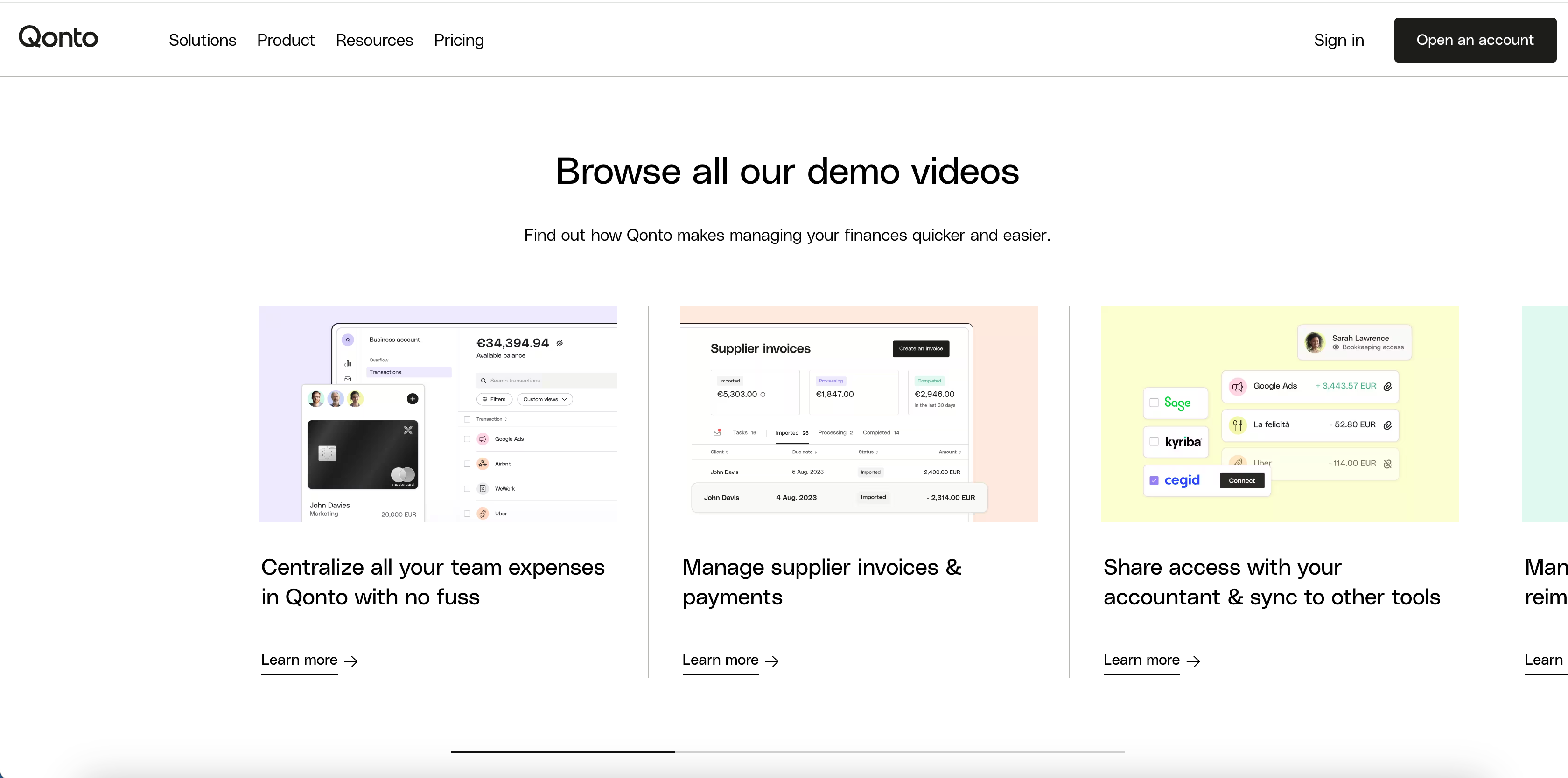
See how Davide Bessi at Qonto uses Navattic to create a resource hub of product tours on Qonto’s website.
How do you use interactive demos at Qonto?
Qonto is a European fintech start-up and I mainly use Navattic to create demos and product tours for our website.
This allows prospects visiting the site to learn more about the features we want to promote and what they can do after registering.
Why did you add a demo hub to your website?
We wanted to create a resource hub on our website.
This hub would allow both our sales team and inbound prospects to navigate through it, find it on the most important search engines, and get to know the products without the need to ask for a proper demo in person or go through the registration process.
So, prospects could experience value very easily in a few clicks.
Why choose multiple targeted demos over one comprehensive demo?
For us, it was about how to split information, because our product can do many things and it's for many different personas.
To digest the information and to be sure that we were tackling the specific needs of our prospects, we usually segment the different sections of our product and the different tabs we have in our interface.
That way prospects can just get what they really want instead of going through a long demo showing all of the features.
How did you expand from one to multiple feature-specific demos?
We started with a high-level demo of the whole product, without a very detailed explanation of all the features.
We put it on the website and we saw it worked. From there, we decided to see how could scale it up and create a demo hub for it.
We could then create more detailed demos that were shorter but more dense in the kind of information we give.
The process of getting buy-in was mainly analyzing with the website team and the other key teams on how to onboard more prospects on our platform.
To scale it quickly, we first drafted the demo in English and then duplicated and localized it for our core markets.
This approach meant we didn't have to start from scratch each time; instead, we could duplicate, maintain the same flow, and simply update screenshots and text.
Did you need any internal alignment to launch this resource hub?
We're quite free to experiment with the content on our website.
The main focus is on presenting the right information at the right time without overwhelming users. We didn’t want to put too much product information, so we built demos that are short and engaging to tease the product.
We are flooded with information, and when selecting a product from a business, being overwhelmed is the last thing we want.
Working in the fintech industry also means careful attention to copy use due to compliance requirements. Ensuring information is presented correctly is our primary concern.
Breaking down the information to make it digestible has proven most effective for us.
Any tips or recommendations you'd have for someone new to Navattic?
The help center you have is quite insightful and very easy to navigate for finding information. The UI of Navattic is very clear, making it easy for those familiar with similar tools to start using Navattic without significant obstacles.
It's also very interesting to analyze the breakdown of the different steps in a demo to see where the most significant drop-offs occur, so you can tailor and optimize the sequencing of the demo.
This feature of Navattic is quite useful.
You can picture in your mind how people will use it and how they will navigate through it, but sometimes the data tells you that the reality is different from what you initially imagined.
